Early Game Alarm – Before and After Series
During the 2.5 years our app’s been on the App Store it went through a lot of makeovers. But there’s one screen that has undergone the most changes. This is its story. To see how other screens have transformed, you can check my old post.
The problem with iOS restrictions for third-party applications
While making Early Game Alarm, we encountered one major problem: third-party alarm clocks on iOS have certain limitations. I’ll try to explain. They need notifications enabled in order to ring. However, if you turn on the mute switch or enable Do Not Disturb mode, these notifications will be silenced. There’s exception for that, too! If the app is left open, then it will be able to make a sound, no matter whether the phone is locked or not. Great! Simple! Ooor not?
I used several sentences to make this clear in this blog post. When I talk to people, I still cannot give enough information in just one. Since I’m not in direct contact with all our users, we really needed to make this problem understandable through the app, because there’s no use of an alarm clock (no matter how awesome it is) if it doesn’t ring. Don’t you agree?
What we believed was a simple and elegant solution
So, somewhere, somehow we had to put this (not so) tiny piece of the information and hope everyone will read and understand it. Since it is essential and it really should be highlighted, we dedicated one entire screen to it. And this is how that turned out.
Why nobody read our screen
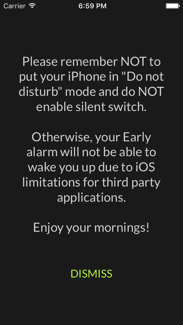
This looked like something people used to sleep over at the beginning of movies. Thankfully, this version survived only beta testing, and never reached real users. It was an eyesore, comparing to the other shiny, sparkly, colorful screens. Before our big release, we tried to spice it up. So we came up with this.
It made sense back then, I swear! 🙂
First, we chose the “positive” approach. Instead of telling users what they shouldn’t do, we explained what they should do so the alarm could ring. We read somewhere about how that is better. Also, the OK button seemed so generic, and we chose “I understand” text to somehow imply to the users that there is something that should be understood. Then, to make this horribly long text “fun”, we highlighted some important words. But, it wasn’t just that. The main reason we did this is that we were hoping to reach more people. Even the ones who really don’t like to read would at least glimpse some of the important words and, hopefully, that would catch their attention. And were we wrong! Not one person read it. None of our friends, family members, coworkers, nor external testers ever read it. Only some people we asked to check up our English did. But even some of them got pretty confused. As soon as we observed several people during UX testing routinely skipping this screen we knew we weren’t even close to solving this problem. What’s worse, we got some App Store reviews from disappointed users who felt let down by Early – it didn’t wake them up, and they had no idea why (even though I explained it).Joy & Neat to the rescue
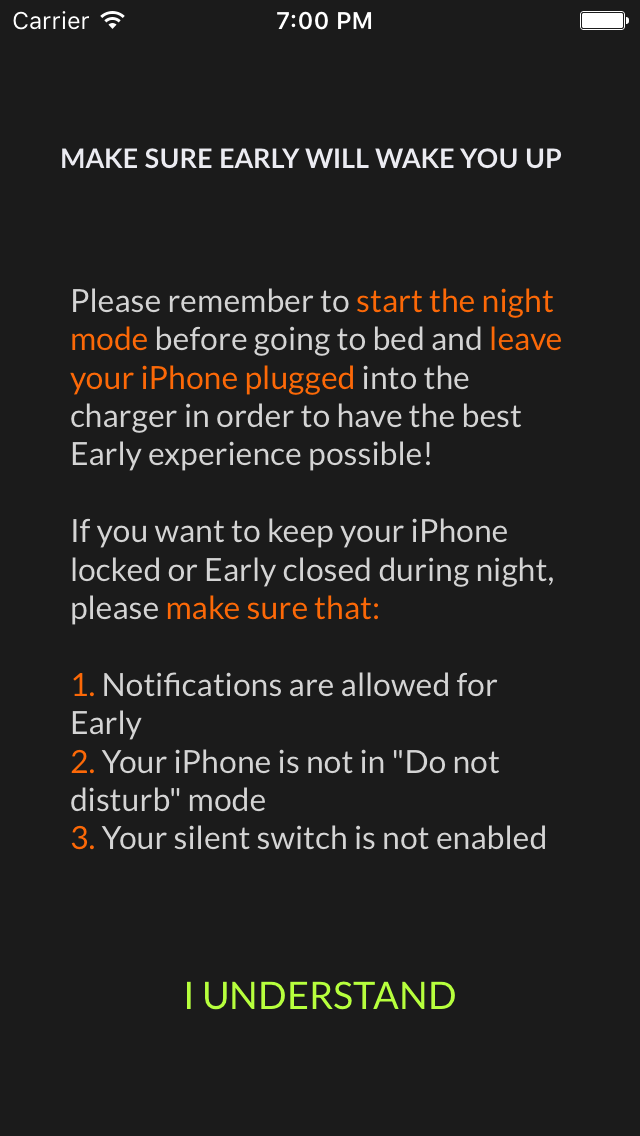
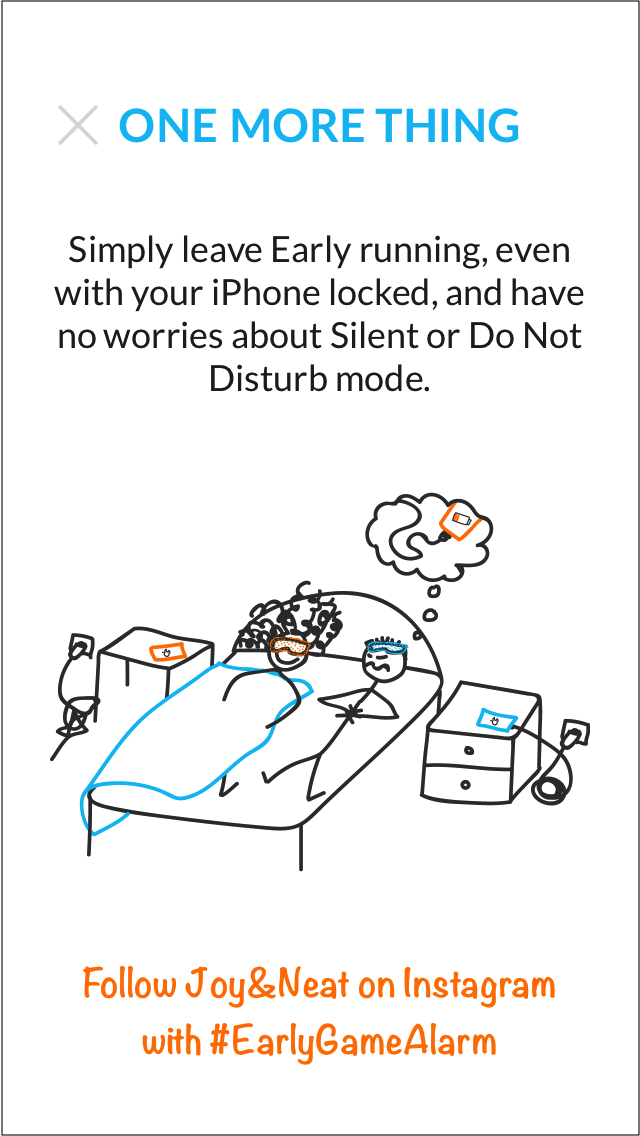
This screen needed a significant makeover. So that is precisely what we did. We literally inverted it. The new background was white, text black, it had an unusual illustration and some hashtags. It was nothing like the previous one.
Do Not Disturb – Early is running
Conclusions we got until then: we needed something short & sweet and not too different from the rest of the app. Finally, a solution that fits appeared.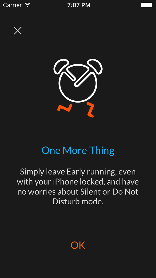
The number of downloads remained the same and bad reviews stopped coming. But, that might have had something to do with the possibility to answer on them, which App Store introduced somewhere along the way. We still don’t know whether all this helped or not. We are still not sure does anyone read this or not. But at least we could say it does not look like titles and credits anymore.
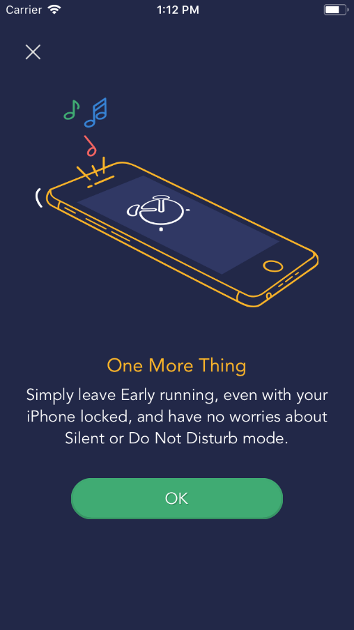
And then brand new redesign came, and the screen got a fancier and less abstract drawing, that shows how Early is on the screen while the phone rings. It also matches a lot more with the rest of the app. We’ll see how it goes now that we made the change again.
Sometimes we don’t even notice how far we have gone until we look back. And as soon as we realized what we did with this screen over the months and months of development, we wanted to share our story with others. We are aware there’s still a lot more to be done. But maybe we don’t have to do it alone. We’d love to get ideas and tips.

Best Amazon FBA course: Top picks for 2025

Connect Shopify to Amazon: Step-by-step in 2025
C2B e-commerce