Case Study: How Sorella Apothecary became a renowned cosmetic brand with (almost) ZERO money spent on ads
Working in the health and beauty industry and competing with thousands of competitors isn’t easy. I know that firsthand; I got out of that wagon running and screaming.
But some people really know what they are doing.
We were accidentally introduced to the Sorella Apothecary brand and stayed on top of it for a reason. Danielle and Emily, the two founders, did an amazing job capturing our attention with their story. As for the rest, keep reading to find out what makes them tick.
Let’s gooo!
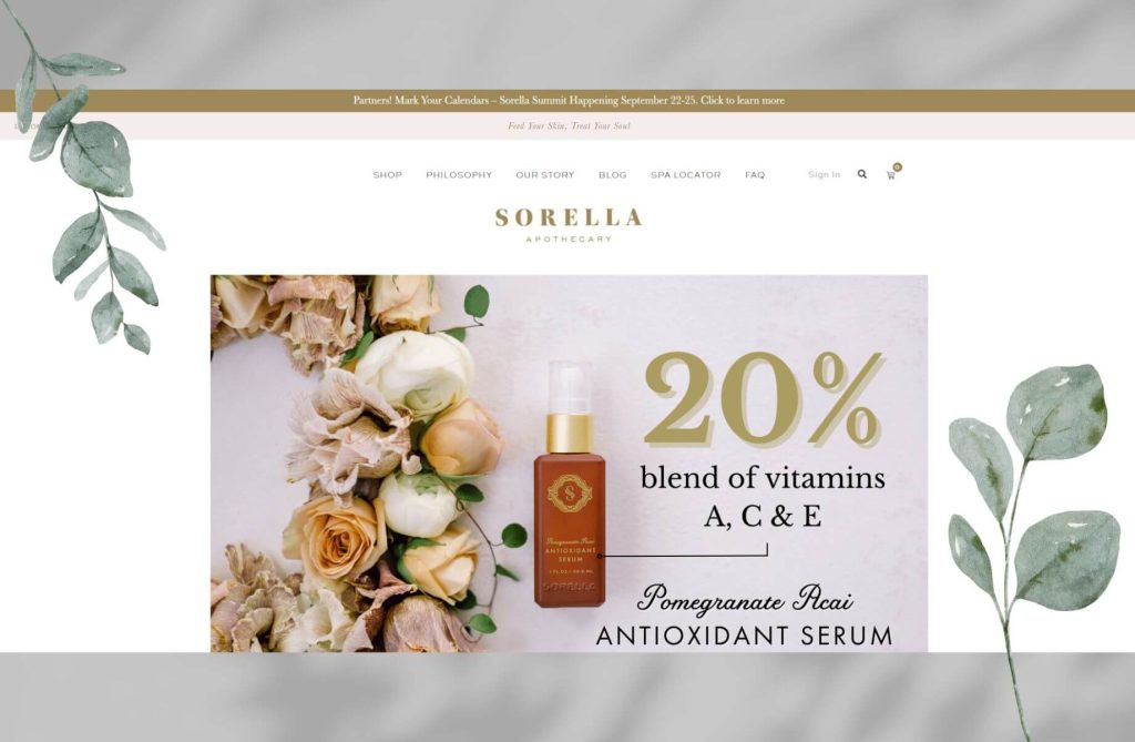
Table of Contents
History
Sorella Apothecary was dreamt up by two self-proclaimed ‘beauty product junkies’, as they say. Two sisters-in-law who started dreaming their dream much earlier. But finally made that dream a reality back in 2017 with only a team of 5.
United by their love for skincare and the quest for the perfect product line, they launched Sorella Apothecary to fill the gap they always found in the market – the lack of cruelty-free natural products.
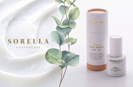
Sorella Apothecary combines nature with science to create skincare that really works for everyone. It sells its products online, through partners, and in spa centers (where it is used for treatments). With experience in creative marketing, broadcast journalism, and esthetics, Emily and Danielle created a brand focused on inner luxury and efficacy.
Product
OK, finally, let’s talk about what Sorella Apothecary made popular – their high-quality and natural products.
They have a program for anti-aging, breakout-prone skin, dark spots, dryness, dullness, eye area care, large pores, and redness. Their product lineup includes body care items, cleansers, exfoliants, eye creams & patches, masks, moisturizers, serums, SPF products, toners, kits, and tools. Designed for individuals seeking luxurious, effective skincare solutions, their products aim to restore balance and strengthen and nourish the skin.
Tech stack
For online selling, Sorella Apothecary uses WooCommerce, which is a popular WordPress plugin for creating web shops. With millions of ecommerce sites online, it is one of the most popular platforms for building web shops, along with Shopify.
They use one of the most popular page builders, Elementor. This gives them a great deal of freedom and ease of change. However, it comes at a cost of higher maintenance and sometimes a greater website load time.
You need good hosting infrastructure to power your webshop and keep you safe. Sorella Apothecary chose to use WPEngine, one of the leading hosting providers for WooCommerce, which was a good decision. Having the caching well set up for site speed led them to a decent Google Lighthouse Performance score of 86. You can feel the site being reasonably fast, which is a must if you want to compete online.

They also use a few interesting technologies to help them be safer and faster, such as Cloudflare, which we always recommend. It is a great tool that works as a CDN (Content Delivery Network), offloading some of the work from the server and speeding up delivery time for images and other assets. Another great thing about Cloudflare is that it helps you fight against DoS and DDoS attacks.
And if you are not a techie and read through this, KUDOS TO YOU! So, let’s see how this all looks from the end customer perspective, shall we?
User Experience
You might think having a great product is enough. Well, guess what? Sales and marketing professionals would be out of jobs if that were the case. You need not only to have a great and differentiated product but also to persuade people to trust what you say.
So you need the whole package. Beautiful and easy to use!
Let’s see how Sorella Apothecary is doing on making the webshop easy and pleasant to use.
Navigation
It is a bit peculiar that there is no way to get to the homepage from the top navigation. Users need to put the URL directly. Some of them might figure out that the centrally positioned logo will take them home, which is easier to do on mobile because you might accidentally tap it since it’s quite close to the menu button.
Partnership links should be better positioned and clearly marked as a call to action. Having them as a button might do the trick, as this page is very important. The login link is easy to spot; you would expect it to be positioned at the top right. But one thing is confusing. How do I make the account? There is no register link anywhere, and there is no explanation of what’s going on.
Now, if you are one of Sorella Apothecary’s partners, you probably have the login instructions. But if I’m a simple customer trying to buy a product, this is quite confusing and should be removed.
Homepage
The Sorella Apothecary homepage introduces visitors to its philosophy and product range through a structured layout. Key sections of their homepage include:
- Hero section
- Bestsellers
- Partnership section
- Blog section
- Brand statement
- Social media showcase
This homepage layout has the elements of a high-converting page, but its effectiveness depends on execution. To maximize conversion, ensure each section is optimized for user engagement, with clear calls to action and a seamless user experience.
The hero section is a slideshow gallery that features their offers and upcoming events. It would be better to catch visitors’ attention with the USP and not the featured product. Most users who visit the website will not know where they landed and need to be onboarded first.
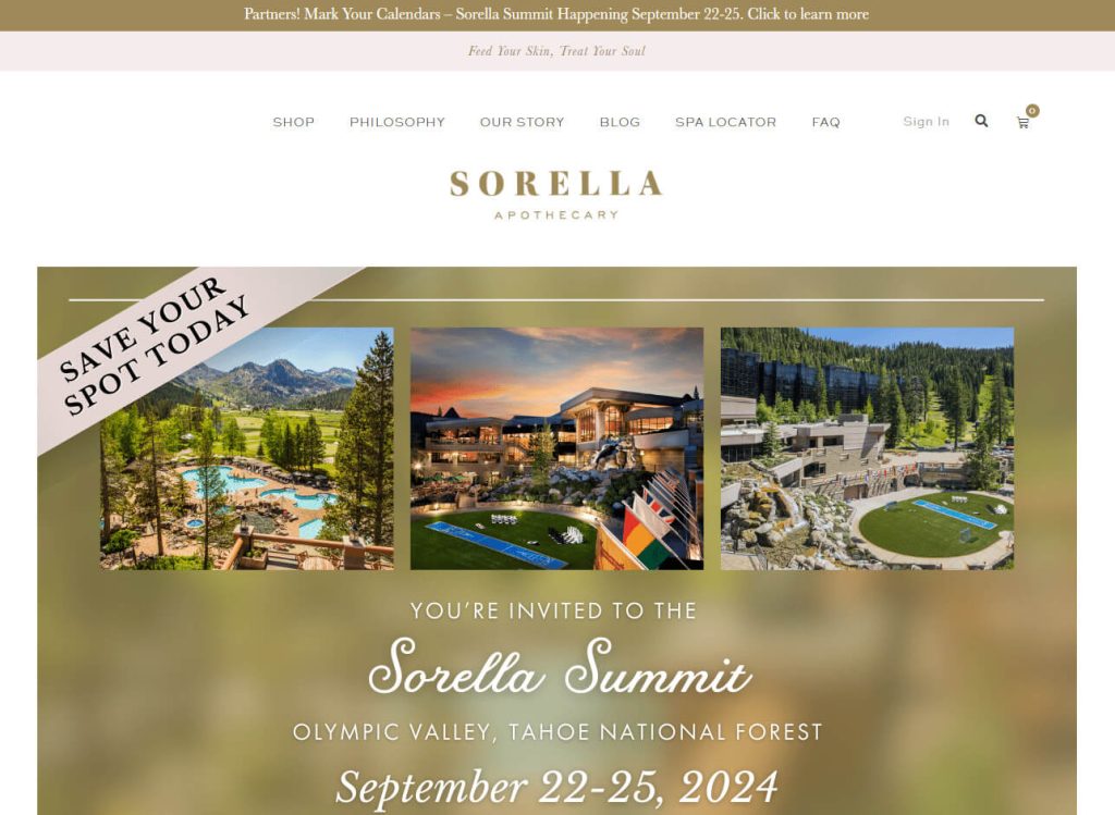
The approach towards visitors should be informative and engaging. Guiding users through product discovery to purchase. Some sections could engage visitors more:
- Sections like Ingredient Spotlight could educate visitors on the products’ natural and scientific blend, increasing transparency and trust.
- A Skincare quiz section might personalize the shopping experience. And can guide users to products suited to their skin type or concerns.
- Incorporating a Sustainability commitment section could also appeal to environmentally conscious consumers, showcasing the brand’s dedication to eco-friendly practices.
To recap…
Telling a compelling story and building trust on the homepage is essential. And even though Sorella makes an effort in a few slide images, the average user seeing the webshop for the first time is probably not 100% sure where he is and whether she should trust this store. A good example of this can be taken from the Natural Beauty group, which has featured customers’ reviews, as shown in the image below.

Product page
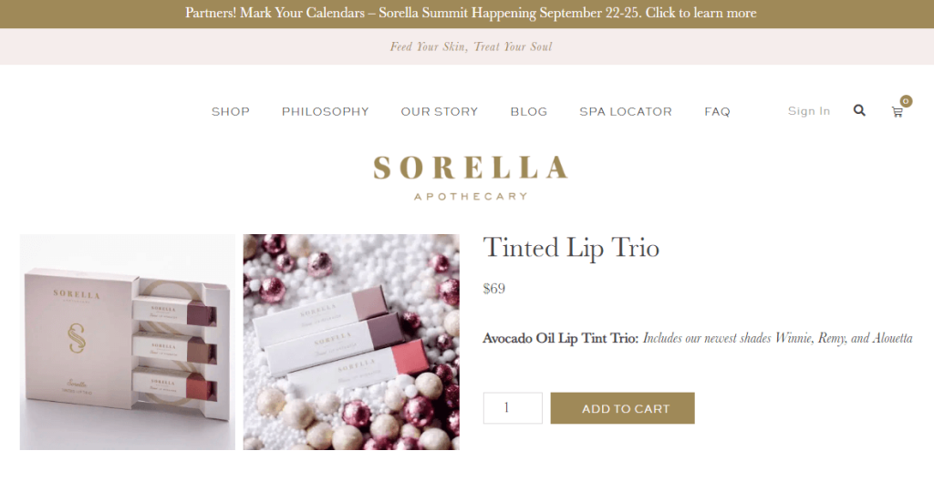
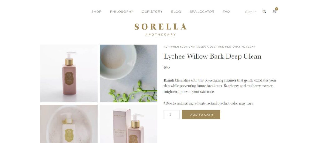
The product page presents a clean layout with the product prominently displayed, complemented by high-quality images. The “Add to cart” button is in a muted gold tone, which aligns with the brand but may lack contrast against the background for optimal visibility.
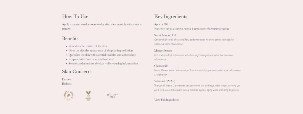
Below each product is a nice how-to-use guide, as well as a list of benefits and ingredients.
This page does not appear to use social proof like customer reviews, which could increase buying confidence.
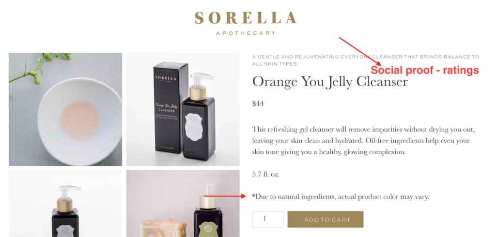
Additionally, reassurance elements such as guarantees or free returns are not immediately visible, which are often key in converting users into buyers. Including these elements could strengthen the page’s persuasiveness and trustworthiness.
We see a wonderful and genuine note, “Due to natural ingredients, actual product color may vary.” This very subtly not only sets the expectation about the possible color mismatch but also conveys an important message that this product uses natural ingredients.

Listing pages
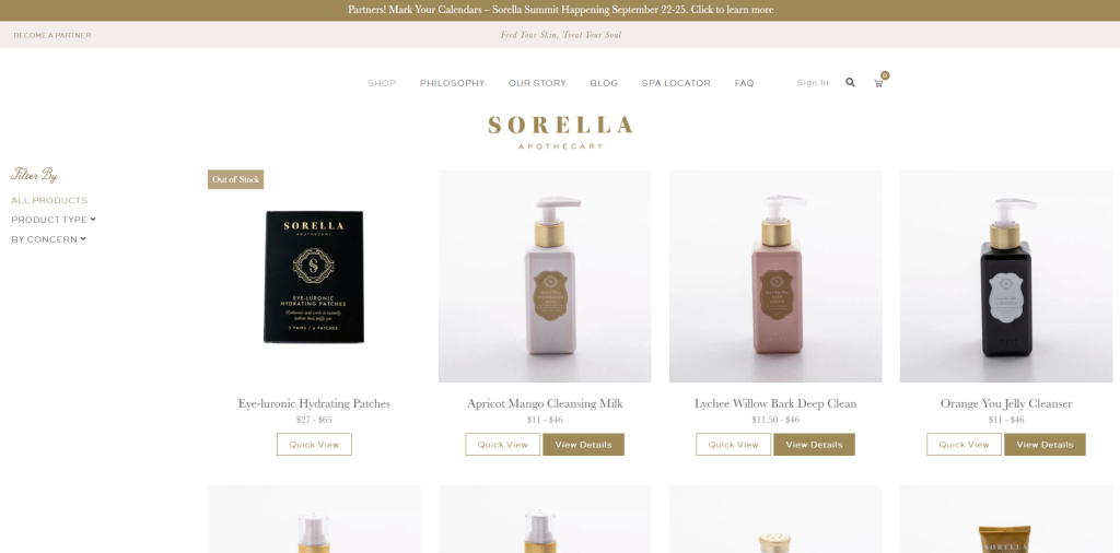
One of the main things to like about this website is how clean it looks and how much attention it takes to remove all the things that would distract from the products.
With not a lot of products in the shop, sorting and filtering would not produce a considerable impact, thus implying the “Apple” design principle of removing everything nonessential. This is hard to do, but Sorella Apothecary did a great job at it.
One recommended addition to the page would be a short description of our current category. This could highlight the category’s benefits or further explain the problem this set of products solves for the customer.
Another thing to learn from Sorella Apothecary is product consistency. Each image is taken in the same way, and they make the extra effort of showing additional images on hover. These images are specifically given another context to widen the user’s imagination. Again, great work!
Search
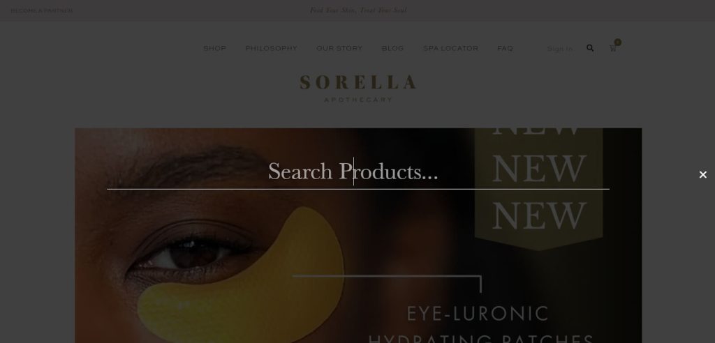
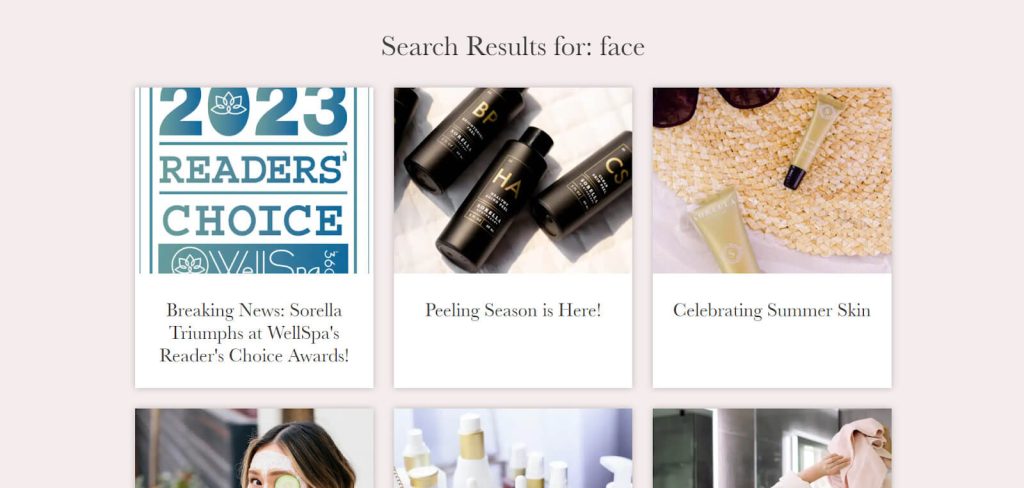
Search functionality is important for online stores because it allows customers to find exactly what they’re looking for quickly. Sorella Apothecary’s search does the searching – but only inside the blog section.
Searching for terms like ‘face’ or ‘skin’ revealed many blog posts but zero products. This is a quick fix in WooCommerce.
Cart
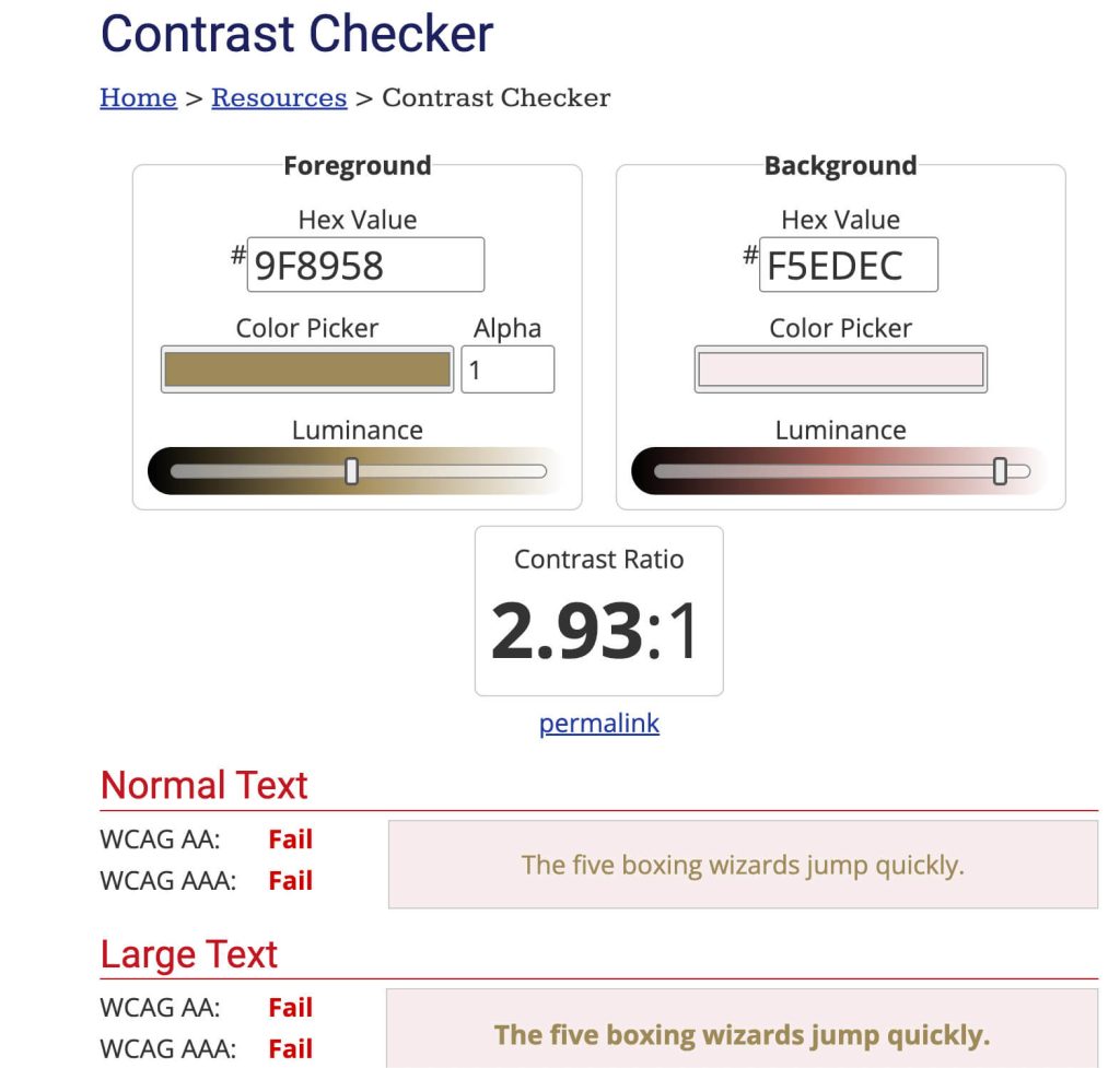
Since there is no online selling without the ‘Add to Cart’ button, it is one of the key elements for an ecommerce store. The muted gold (#9F8958) choice for the ‘Add to Cart’ button is a subtle, brand-aligned choice, but it may not be the most visually compelling to drive conversions.
There are no upsell or cross-sell opportunities (apart from the ‘You might like’ collection), and bundle packages could significantly increase the average order value. The absence of reassurance elements like security badges or customer testimonials might affect the trust factor for new customers.
Not using abandoned cart strategies is a missed opportunity to recover potential lost sales, as these tactics are proven to bring customers back to complete their purchases effectively.
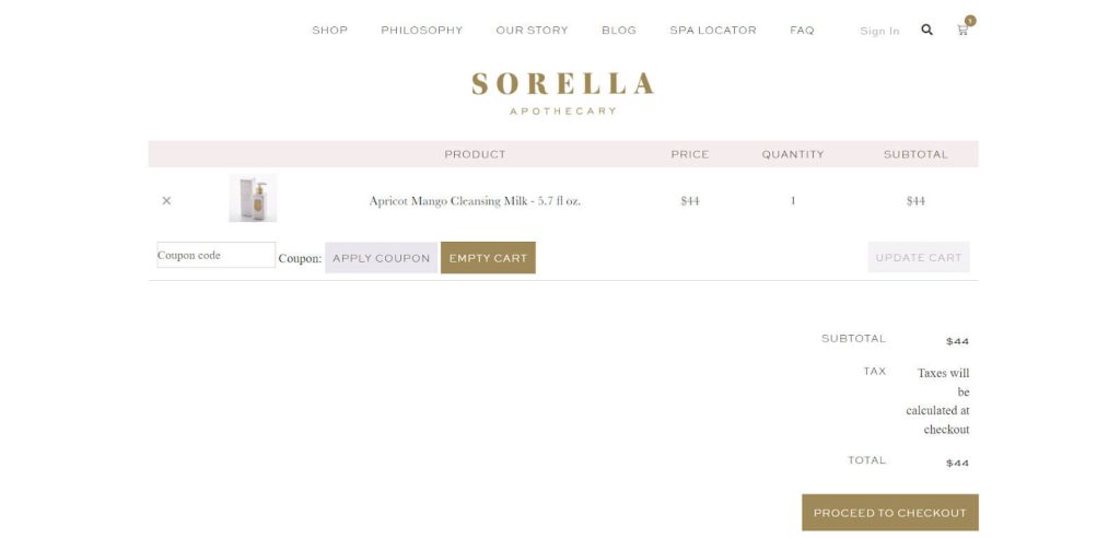
When a product is added to the cart, the ‘View cart’ button is not placed correctly:
Header
The header of Sorella Apothecary’s website is elegantly minimalistic, featuring clean navigation that directs users to key areas like the shop, philosophy, and brand story.
The ‘Become A Partner’ in the left upper corner encourages professional engagement—the partners they’re looking for are probably spa centers and salons. The search function and shopping cart are intuitively placed for easy access. This header layout is user-friendly, though some may suggest adding more prominent elements to enhance user engagement. The ‘Philosophy’ and ‘Our Story’ sections might confuse the visitor since they might refer to similar content.
Footer
The footer of Sorella Apothecary’s website presents a clean and minimalist design, offering essential links like FAQs, shipping and returns, and privacy policies to comply with regulations. It includes a section for users to follow their social media channels, promoting continued engagement, and a newsletter subscription prompt for marketing outreach.
The design appears balanced and user-friendly, with easy navigation to key information and opportunities for continued customer interaction.
For improvement, Sorella Apothecary might consider adding a more prominent call-to-action in the newsletter sign-up area to increase visibility and conversions. Including trust signals like security badges or customer service guarantees can also enhance user confidence.
Accessibility
The topic of accessibility is very much becoming more focused because of the Americans with Disabilities Act (ADA). This is a federal civil rights law that prohibits discrimination against people with disabilities in everyday activities.
Meaning…As a site owner, you have to make your site accessible!
And it comes to your benefit, really!
Firstly, if your site is not accessible, you will lose roughly 5% of sales. People with disabilities do shop online, just like everyone else. Another benefit is that making your site accessible will also improve your SEO and Google rankings.
Overall, Sorella Apothecary is doing a nice job, with the site being as simple to use as possible. However, in terms of accessibility, more needs to be done to make the site fully accessible for all users. We’ve been successfully implementing accessibility standards, so we know how important this is.
Touching upon color-blind users and the older population. One thing to know is these users need higher contrast between letters and background. Even though the color scheme perfectly fits the branding with its gentle colors, it does not provide enough readability. For example, the top navbar has insufficient contrast between the background and the font color, as we can see.
Visual Design
The designers thoroughly understand the personas of those shopping here and adopt the whole brand for that target audience.
Their choice of soft colors is beige, light pink, and brown. They are complemented by the gentle details of a light purple hue and coupled with the use of adequate, softer fonts. This crafts a message of understated elegance and warmth.
These colors evoke a sense of calmness, purity, and natural beauty, subtly conveying that the brand’s products are designed to enhance rather than overshadow the customer’s inherent beauty.
Sweet Sans Pro, while modern and clean, might present readability challenges in smaller sizes or when used extensively in text-heavy documents. Similarly, the serifs and intricate details of Monotype Baskerville, although elegant, can become less legible in small print or on low-resolution screens. The combination of these two fonts is not an ideal choice in the cart.
UX summary
Let’s summarize the complete webshop experience. The feeling of using the website as an ecommerce professional was very compelling. Everything we needed to find was easily reachable within a few clicks. The whole interface is very minimalistic, with as little overhead as possible, and is focused on getting you to the end goal, which is the purchase.
We do see a lot of potential for improvement in terms of building more trust and credibility with new users and focusing on improving design details to make the site consistent and accessible for all. All the existing users will be coming back because of the product quality, but conveying the assurance of that quality to users interacting with the brand for the first time is essential.
Marketing efforts
Now, let’s go through the strategic deployment of content across various social media platforms and determine the efficacy of their social campaigns in driving sales. We’ll identify Sorella Apothecary’s profile strengths and pinpoint areas for growth.
Social Media
Hats off to Sorella Apothecary’s social media efforts!
The brand is smartly using social media to create a loyal community around it —and it seems that works very well for them! Through engaging posts and interactions, they’re building strong connections with their followers. Because of their success in creating a dedicated customer base and loyal customers, launching a mobile app or loyalty program could be a smart move.
Their B2B partners are doing a great job of promoting their products, but some endorsements from micro-influencers would add up to the brand’s strength and trust. Especially in D2C webshop sale.
Even though the company opened in 2017, the Instagram account under the name @sorellaapothecary has been active since 2013. That says a lot about the time that went into planning. And it’s definitely a thumbs up for picking up the accounts on networks beforehand.
1.2K posts in roughly 6 years of activity is close to 4 posts per week. That’s not much, but it’s enough to get them to 42k, most likely organic followers. Thumbs up!
They share a mix of product highlights, skincare tips and quotes, and customer testimonials. Reels is doing pretty good with 10K+ views per Reel! So, with different content types, they are mainly focused on showcasing their products.
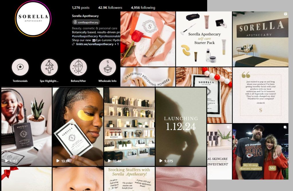
It appears they aren’t using influencer marketing, which might be a good opportunity to increase conversions. It seems that their customers are creating posts on their own, which is amazing and always recommended. If they show their products in action by themselves, they have full control of what message they are sending.
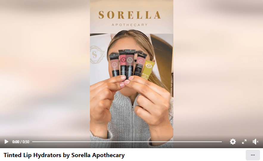
Sorella Apothecary’s profile is followed by 21k people, about half of whom are on Instagram. Their content is similar (almost the same) to that of Instagram, and it seems they have a nice community behind the brand.
Content that gained more attention than others is a Reels/video type. With a maximum of 3.2K views, their best-performing content was a video made for tinted lip hydrators.
According to this, avoiding high-professional images showcasing how their products look might bring more people in.
Youtube
Sorella Apothecary has a YouTube channel, but there are no videos. However, they had an interview back in 2021. The founders, Danielle and Emily, discussed their unique bond as sisters-in-law and their journey in creating Sorella Apothecary.
The conversation highlights their commitment to education and support for spa partners during the pandemic, showcasing initiatives to enhance connection and learning. They also touch on new product launches and the importance of ingredient integrity and customer service in their business model.
Since that video, it seems that the brand has grown a lot, which means maybe it’s time to make another interview with more up-to-date information.
TikTok
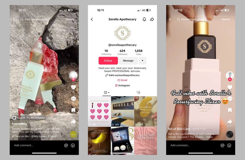
Sorella Apothecary has an active profile on TikTok, but none of the videos gained many views. Although similar content was published on Instagram, users of this social media network prefer different content.
However, if you use the TikTok search engine as the search engine, many users have been creating videos mentioning their products, unboxing orders, etc., which is a clear sign that using UGC creators might increase brand awareness and conversions.
B2B Wholesale and partners
Working with distributors makes a lot of sense for businesses with a great product line, such as Sorella’s.
A simple Google search will reveal multiple companies proudly featuring Sorella products in their shops. Just to name a few:
But wait, there is more. Much more, actually.
What makes Sorella a great brand is working hand in hand with their partners. They will be a great partner if you are an esthetician or spa professional.
Sorella is a textbook example of how partnerships work. Take care of your partners and help them learn and grow. It will all circle back.

SEO
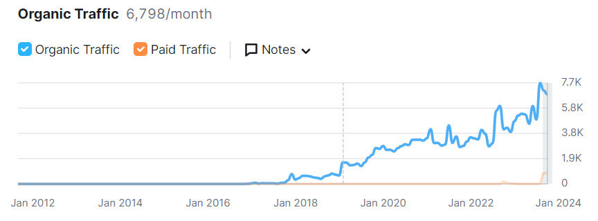
Sorella Apothecary’s organic Google search traffic has increased substantially and steadily over several years, particularly since early 2020.
This suggests successful SEO efforts, likely through consistent content creation, keyword optimization, and perhaps strong backlinking strategies that have improved the site’s visibility in search engine results over time.
The minimal paid traffic implies a strong reliance on organic reach, which can be cost-effective and sustainable if maintained with ongoing SEO best practices.

They have a total of 1793 organic keywords that are generating the most traffic to their store in the US.
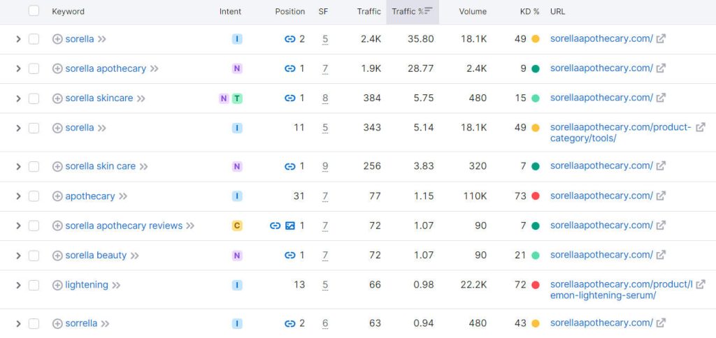
Most of the keywords have the informational search intent type.
This chart displays a breakdown of keywords by user intent for a website, which is a crucial aspect of SEO strategy.
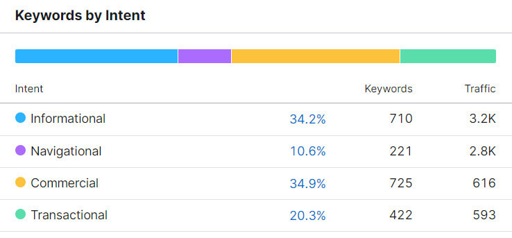
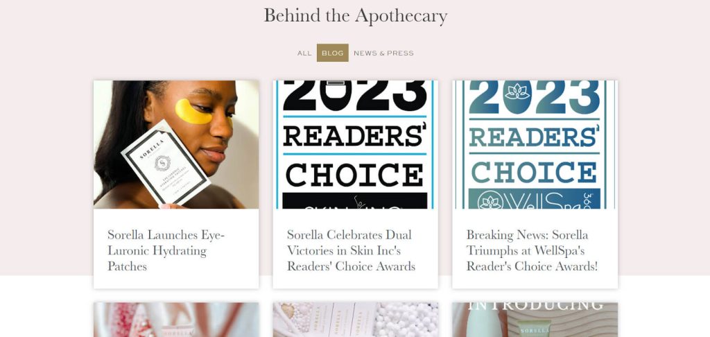
Informational queries lead in both keyword count and traffic, indicating strong content that meets the audience’s need for information. These searches are often phrased as questions and use words like who, what, where, why, and how. Sorella Apothecary is already using social media content to educate people about skincare, but it would be nice to include more how-tos in the blog section of the webshop as well.
Navigational queries also drive significant traffic, suggesting brand recognition.
Commercial and transactional queries have fewer keywords and less traffic, which could hint at a potential growth area for more focused content and optimization to capture users ready to make a purchase or engage in business.
Paid Marketing
Facebook Ads
Currently, Sorella Apothecary is running 8 ads on Meta. Sorrella Apothecary’s Facebook ads showcase their skincare products’ unique benefits, leveraging emotional and sensory language to appeal to consumers looking for hydration, relaxation, and natural ingredients.
They employ engaging videos as a hook and include clear calls to action like “Shop now” and “Learn more” to drive sales and increase brand engagement. By highlighting different products and promoting their spa services, they aim to appeal to a broad audience, build a follower community, and enhance customer experiences both online and offline.
Here are suggestions for Sorrella Apothecary’s Facebook ads to make them perform better:
- Test different ad elements to determine what works best (they probably did this and concluded that videos perform best).
- Streamline ad copies to be more concise.
- Insert customer reviews in the ads for authenticity.
- Implement retargeting to re-engage interested viewers.
Search Ads
Sorella Apothecary has been strategically using Google Ads since December 2023 but has recently paused campaigns. They focused on two key phrases in their paid search strategy to reach their target audience effectively. Over the past year, they’ve expanded their approach, utilizing 17 keywords to diversify their reach and address a broader spectrum of skincare concerns.
By using paid ads for “sorella apothecary,” “sorella skincare,” and “sorella apothecary professional,” Sorella aims to boost its search visibility, drawing in users searching for their brand or related skincare products. This focused advertising strategy enhances brand recognition and targets a specific audience, streamlining their online marketing efforts.
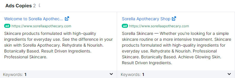
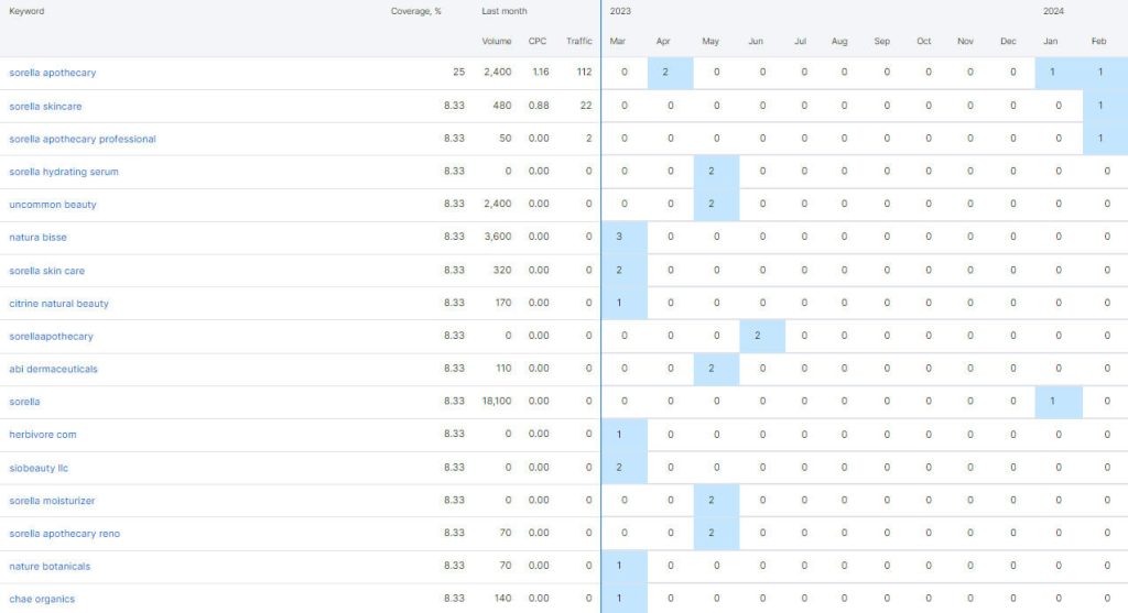
To improve their Google Ads strategy, Sorella Apothecary could consider expanding their keyword list to include broader skincare concerns and trending topics, ensuring they capture a wider audience. Utilizing A/B testing for ad copy and landing pages can pinpoint what resonates most with their target demographic. Additionally, incorporating more ad extensions, like site links or callouts, can provide potential customers with more reasons to click through. Finally, optimizing for mobile users and leveraging retargeting campaigns could significantly enhance engagement and conversion rates from their ads.
Sorella Apothecary Case Study – Key Takeaways
Sorella Apothecary is a standout health and beauty ecommerce brand that blends nature and science for effective skincare. Founded by two sisters-in-law, Sorella aims to fill the market gap with cruelty-free, natural products from anti-aging to hydration. We looked closely at their social media, webshop, and customer engagement, solely based on external data, and made this Sorella Apothecary case study with the goal of analyzing good case practices and learning from the best.
- They have a reasonably strong social media presence on Instagram and Facebook and have the potential to grow more through influencer partnerships and user-generated content.
- Sorella’s main growth model is through B2B partnerships with estheticians or spa professionals. They do a great job at making strong connections, educating their partner network, and helping them succeed.
- The webshop is built on WooCommerce, which offers a decently fast, secure shopping experience.
- We found opportunities to improve website navigation, accessibility, and readability for a broader appeal.
- Ensuring the website and its features are fully optimized for mobile users can significantly enhance user engagement and sales.
- Including more customer reviews and clear reassurance elements like guarantees or free returns can boost confidence and conversion rates.
- The brand’s organic growth in search engine rankings underscores the effectiveness of its SEO strategy. This has significantly increased visibility and traffic over time without heavy reliance on paid advertising, but both areas show potential for optimization.
Are you inspired by Sorella Apothecary’s success? Let’s take your brand to new heights! Get in touch to analyze your ecommerce strategies and unlock growth opportunities.
