How WWDC Feedback Helped Us Improve Our App
There are times when you cannot see the forest for the tree, and there are times that happens with your design. Even if you’re aware something doesn’t look perfect, being too deep into matter makes it even harder to see the solution. This makes user testing and feedback essential.
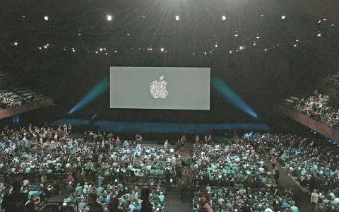
On May 10th, 2016, I received an email saying: ”Congratulations! You’ve been awarded a WWDC Scholarship and a conference ticket has been assigned to you.” The biggest Apple’s dev conference gave me a perfect excuse to finally take a trip to the US. I was looking forward to networking, meeting developers from all around the world and other scholarship winners. It was also a great opportunity to have a sneak peek into the new software before everyone else and hear some new ideas.
Most importantly, I was excited to get some feedback on our app, Early Game Alarm. Getting an expert opinion on user interface from people who personally pick the apps for the featured section seemed invaluable, and it really was. We had a few screens that desperately needed a redesign, which they now got. They are looking better than ever and are easier to use.
As I am sure you already know (if not, visit earlyapp.io), Early Game Alarm is an alarm clock that wakes you up by offering you to play a game to shake you up. If you win, you get a motivational quote to inspire you at the beginning of the day.
We were quite surprised to learn how much we were wrong about the way we thought the app had been used. Now we’ll share some of the improvements we’ve made after getting a bunch of feedback from users, experts and fellow developers.
Settings & New Alarm Screens
The first problem occurred at the very root, while creating a new alarm.
Initial Case:
There was an option to set the default game and alarm tone in the settings. If the user didn’t change the setting, the initial option when creating a new alarm was no game.
Problem:
-
The first time users were usually setting the alarm without a game. After setting the time, tapping on days and colors, tapping on music, they would forget about the game. (Concluded by observing a couple of friends using Early.)
-
Example of real life UI testing: while trying the app the UI expert at WWDC forgot to set up the game for the alarm twice.
-
Even I forgot to set the game many times and I’m the one who participated in its development. Every time the alarm went off without a game I knew how to fix it for the next time, but I was just too lazy to go to settings and change it.
WWDC Feedback
-
Why is the default option “no game”? Why not a random game?
-
Remove the default game and alarm tone from settings – users do not need to think about that; implement smart logic. Users love when their apps are smart and do their job instead of them.
Solution
-
We removed default settings, so our settings page looks more streamlined now.
-
When the first time users create an alarm if they don’t choose a game, a random one is set.
-
Every time a user creates a new alarm the default game is the one he/she used the time before.

The next problem was, the intensity of the alarm sound.
Initial Case:
We thought the most logical thing would be to add a control in settings where users could adapt alarm volume. Also, we set sound volume during the game to extremely low, so people playing games to wake up, wouldn’t wake up their partners or roommates, too.
Problem:
-
System sound volume is something Early Game Alarm can’t control. Users can set up the volume of sound on their phone and the volume of a particular app can then be scaled depending on the system sound. So, if the system sound is set on 50% and app sound is set on 50% too, using our control in settings, then the final volume will be 25% of the total possible sound level. Sounds complicated, right? It’s even worse if user is not aware of this and most of them were not.
-
We were getting complaints that they cannot hear the song, or that the alarm didn’t wake them up.
WWDC Feedback
-
Users do not need to think about that (look above); they love when their apps are smart and do their job instead of them.
-
The melodies are too quiet, and some people might love to hear the music while playing the game. And yes, others might hate it. So, why not give them that as option?
Solution
-
We decided to remove this volume control from settings screen and always send maximum possible sound volume from the app. The final sound volume will only depend on system sound volume.
-
The only volume setting users have now is whether the sounds will be muted during the game or not.

Game Selection Screen
Another problem was that the game selection screen was not intuitive; it wasn’t clear which game is which. Since Early is a Game Alarm, this was a big problem.
Initial Case:
Since circle was the central design element, we thought it’d be a good idea to represent games as circles, too. Each game circle had a little drawing depicting the game. Only the first circle was different. It was labeled “more games” and tapping on it opened a pop up offering a game pack of three new games for purchase.
Problem:
-
Few people clicked on “more games”. Our main call to action seemed a little bit out of place. It didn’t invite users to click. We had low number of in-app purchases.
-
The screen was cluttered, which looked even worse when there were a lot of games.
-
We did not know where to add options for buying more game packs or single games.
-
People, including me, were not sure which game is which. The tiny drawings of the games were not that intuitive. Names weren’t helpful enough either.

Honest Feedback From a Friend:
“I really dislike this screen. Nothing is aligned; I don’t know which game is which. Just looks weird, like a big mess. I recognize catch game on the screen; the others, not.”
WWDC Feedback:
-
You are trying too hard to make people buy; why not just display the games.
-
Games are the most important thing on this screen, and yet, you give them the least space. There is a very big part of the screen that is unused.
-
Your app has unusual design. And you tried to make this screen unusual, too. So let’s do something completely different. Start by trying something conventional. Go back to basics. I know it sounds boring, but that could be a good start.
Solution:
-
Only one game is displayed on the screen at one time.
-
We gave the screenshot of the game more space by placing it in the center of the screen, which also allowed it to be larger. The original idea was to show a gif of how to play the game here, but that was making the app a lot heavier. We still haven’t gave up on the gif, just have to find a better solution. If you might have any advice, please feel free to approach us.
-
The price and tap to buy options are displayed for non-purchased games, so they don’t seem like a different functionality in comparison to default and purchased games.
-
Game packs are animated and display screenshots of all the games in them, so that users are aware what they’re about to buy.
-
User can browse through all the games and packs using simple native picker control.

Motivational Message Screen
And last but not least – the motivational message screen. As we really want to motivate people in the morning, it is important that this screen doesn’t actually put you back to sleep.
Initial Case:
Screen consisted of a motivational message, replay and exit button, and the game score.
Problem:
-
People were not paying attention to messages; they were just skipping them.
-
Font was not as legible as we expected it to be, especially when you’re reading it early in the morning.
WWDC Feedback:
-
The message is important, it should be bigger on the screen, and the buttons should be smaller.
-
Why “play” and “exit”, why not icons, everywhere else there are icons?
Solution:
-
We changed the font and font size for the motivational messages, which instantly made it more visible on the screen.
-
We replaced “play” and “exit” buttons with icons and made them smaller which also made the motivational message more prominent on the screen.

During the work on this app we came along some pretty silly feedback.
EXAMPLE DIALOGUES:
-
A lot of people use circles; why don’t you try with squares or any other shape?
-
But, but, it is the main design idea! Circles represent perfection, they are fun, see how they bounce around, making the alarm clock fun… ☹
-
This is half game half functional thing. Decide if it should be playful or serious.
-
But, but, that is what we wanted, to represent a serious, boring thing like an alarm in fun way… ☹
-
Why would I play a game in the morning?
-
Uh…never mind…just go back to sleep. ☹
On the other hand, at WWDC, besides all the useful feedback that helped us with improving the app, we got a fair share of positive commentary. People offered us help with localization, suggested translators; told us the ways this app could be useful to their children, or fun to their friends. It was a great feeling to hear someone say they liked the games or the design, or that they thought our idea was original and we had a good market for it. Awesome guys from China were happy to present us to their editorial team and offered help to popularize our brand in their country. They also said great things about our efforts on social media promotion.
This was a wonderful experience which helped us feel proud of our work and motivated to work even harder. We are very thankful to all the folks at WWDC and our friends, who were the first beta testers, for spending their time analyzing Early.
If you have some comments on Early, please share with us in the comments and help us improve and grow.

