Publishing on the App Store – Our Top 3 Mistakes
Active learning in Byteout
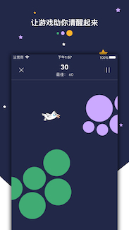
At Byteout we have the practice to learn new technologies by working on “experimental” products – fully functional projects that solve real-life problems, not necessarily intended to go public. After having decided to form an iOS team, we came up with the application we wanted to develop. Like most companies with flexible working hours, we also had an issue with waking up early. So we designed an alarm clock with some easy to play games. In order to turn it off, you have to win the game.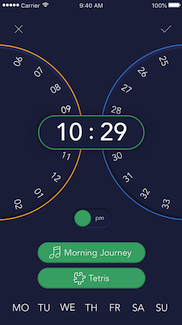
We created the app to make something fun and useful for our colleagues and us but still hoped to reach some traction on the App Store. Our main audiences were heavy sleepers and busy working people. Most developers believe if only they had the right idea and discovered their audience, things would go smoothly. We knew it was not that easy but still had no idea how long the learning curve was if you wanted to make a success. I hope we will make your life easier with these tips and tricks we picked up along the way.
Publishing right on time
According to the marketing plan we waited for the Christmas holidays to publish the app. At this time of the year, people are treating themselves to new iPhones. They are downloading the apps that can perform the latest technology Apple brought to its iPhone users. It was essential to incorporate the hottest trends into our alarm clock so that we would rank better. And so, we launched our app just a couple of days before Christmas (2015). And that was our mistake #1. Other developers and marketers were making a buzz about their new products far in advance all over the Internet. After being published in the most famous magazines, they hit the top rank on the App Store quite easily.Much later we found an amazing tool App Annie and used it to analyze their peak times (when most of their units were downloaded). Then we checked those dates using Google history and found a bunch of articles featuring the applications of our competitors. We hadn’t contacted magazines and portals in time to get in the race. That Christmas, we were just a new app with no established brand, ratings, nor downloads.
Pricing model
We started optimistically with the initial app cost of $3. We made real calculations and projections to obtain that number. We weren’t lazy, we weren’t greedy, we honestly thought our math was correct. That was our mistake #2.Website & social media
Our social media profiles were quite useless. Aleksandar Vacić was really kind to advise us as a developer who already had a lot of success on the App Store. He told us not to waste time on social media unless we had a couple of thousands of dollars to burn. He was right. However, it is good if you have your website featuring one or several applications, depending on what are the focus and target audience of all of them. It should contain some sort of contact form. The website has to look perfect on mobile because that’s where your customers come from. This is also a thing we did wrong at first – we put a lot of time and effort into making our promotional website look perfect on desktop, and even though it was responsive, it was not really user-friendly on the phone. We figured that out much later, during our user testing sessions.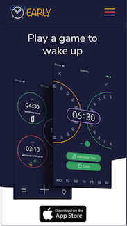
Tracking analytics
We tried to keep track of the App Store analytics, to figure out where all the downloads were coming from, but it was hard to be sure about the conclusions. Each event that we would have noticed caused another series of events, and it was hard to realize which one was the initial trigger. We did some Facebook ads at the same time when a few magazines featured us, so at one moment we had a peak with around 14.000 visits, and we were not sure what brought them to us – we couldn’t see the source on the App Store metrics.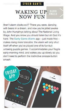
Also, we didn’t really understand why we had such low conversion rates (17 purchases for 11 months). And that was our mistake #3. In the beginning, we didn’t implement any analytics tracking systems in the app – we completely overlooked that. We had no idea how our app was used, what were the users’ pain points and if our updates solved them. It took time before we figured out what we needed and how to implement it correctly.
Improving User Experience
Nevertheless, things were finally going better than we expected and after 15 months on the App Store, we had 12.000 downloads. We were carefully following what our users were saying and read the reviews on the App Store. We used Mixpanel to track the events and learn which were the favorite features and which ones users didn’t need or didn’t know how to use. Then we conducted some user testing to make a decision which features we keep (improve if necessary) and which ones we had to get rid of. Whatever is not relevant for the users only clutters the interface and makes application unnecessarily complicated. At the time we were doing the first redesign, two of our colleagues got scholarships for WWDC 2016 and got a lot of advice from Apple professionals on how to improve our user experience. Jelena, one of our team members, wrote a detailed description of what we learned and how we used it to improve the app. After doing all that, the number of purchases increased (10 units each month, on average). Old design of the screen where the purchases were offered:New design:
Reaching the ultimate goal – getting featured
We never even dreamed we would have reached 35.000 downloads, 200 daily active users and more than 1.500 alarms created weekly. Early Game Alarm was our pilot project but it was well received even with almost no marketing budget. We did a complete redesign to bring some fresh style and improve the experience. And, after almost 3 years, we finally got featured – all across Europe and Indonesia! We can’t say this was an overnight success without effort. We submitted the App Store Promotions form twice, wrote & shared a lot of blog posts, contacted friends, bloggers, and influencers, created two “Inspired by Early” sticker apps. But we finally made it, and the results were quite nice (a thousand of downloads in just one week, without ruining the retention rate this time).We’d like to thank everyone for their support – all consultants, translators, publishers, users who left their honest reviews, and so on. We couldn’t make it without you.
Our struggle continues, though. Because of some third-party app restrictions, Early can sound off in “Silent” and “Do Not Disturb” mode only under specific conditions.
So, if you are an engineer at Apple, or know any of them, please make an Alarm Clock API for us and help Early get even better 🙂
